The Chanel No. 5 Bottle: A Century of Design Genius
The Chanel No 5 bottle is one of the most recognisable industrial design objects of the twentieth century
By Julia MorettiFragrenza makes several of the alternatives featured in our guides — here’s how we test.
9 min read
The Chanel No 5 bottle is one of the most recognisable industrial design objects of the twentieth century. The sharp rectangular flacon with the minimalist black-and-white label has appeared in art exhibitions, museum collections, and design textbooks. It is the subject of academic monographs and the centrepiece of marketing campaigns that have spanned a hundred years and counting. To understand modern perfume bottle design is to understand how the No 5 flacon broke from convention, and how that single object reshaped the entire visual language of luxury fragrance.
Before No 5, perfume bottles were predominantly ornate, curved, and decorative. The dominant aesthetic of late nineteenth and early twentieth century perfumery emphasised the bottle as a precious object in the tradition of jewelled containers and Art Nouveau craft. Lalique, Baccarat, and other glassmakers produced flacons of remarkable beauty, but the visual language was always one of decoration, ornament, and the suggestion of nature. The bottle was meant to look like a flower, a teardrop, a swan, an organic form rendered in glass.
Coco Chanel and her designer Jean Helleu broke from this tradition deliberately and consequentially when they specified the No 5 bottle in 1921. The result was an object that looked nothing like a perfume bottle as the category had been understood, and the visual statement was inseparable from the olfactory statement that Ernest Beaux had created in the composition itself. Together, the bottle and the perfume announced a new aesthetic for the entire category.
The Original Design Brief
The exact origin of the bottle design has been the subject of considerable speculation over the decades. The most credible accounts suggest that Chanel drew inspiration from masculine whisky decanters and pharmaceutical flacons rather than from existing perfume bottles. The deliberate masculinity of the visual language was part of the point. Chanel had built her fashion house on the principle of borrowing structural elements from menswear to liberate women's clothing from decorative excess, and the bottle for her perfume extended this principle to the realm of objects.
The original 1921 flacon was actually somewhat different from the bottle that became iconic. It had a smaller stopper, slightly different proportions, and a less refined label. The version most people recognise today is closer to the 1924 redesign, which simplified the original further and produced the geometric purity that has remained essentially unchanged for a century.
The Geometric Argument
The No 5 bottle's design is a study in restraint. The rectangular body, the simple stopper, the unornamented glass, the minimalist label: every element is reduced to its most essential form. There is no ornament, no curvature beyond what manufacturing requires, no decoration that does not serve the function of containment or identification. This visual minimalism has aged remarkably well, perhaps because it was never anchored to a specific decorative period and therefore could not become dated when fashion shifted.
The geometric language of the bottle echoes the architectural modernism that was emerging contemporaneously in European design. The Bauhaus opened in 1919, two years before No 5 launched. Le Corbusier published his manifesto Vers une architecture in 1923. The De Stijl movement was at its height. The No 5 flacon participated in this broader modernist moment, and its survival as a design icon owes much to the durability of modernism as an aesthetic position.
The Material Specifications
The bottle is made from clear glass with high optical purity. The stopper is octagonal, cut to suggest a faceted gem without the ornament of an actual gemstone. The label is printed in black on white, with sans-serif typography that was unusually severe for its era. The proportions are calibrated to produce a sense of stability and presence on a vanity table or shelf, with the rectangular form reading as architectural rather than decorative.
Subtle adjustments to the design have been made over the decades. The glass thickness, the exact dimensions of the stopper, the typography, and the label proportions have all been refined to keep the bottle current within manufacturing capabilities and brand conventions. But the underlying geometry has remained constant, which is part of what allows the bottle to function as a recognisable brand identity across generations.
The Influence on Perfumery Design
The No 5 bottle's most significant legacy is in how it changed expectations for perfume packaging across the entire industry. After No 5, minimalist rectangular bottles became viable luxury packaging. The decorative tradition continued, of course, and many great bottles have been designed in the floral and figurative modes that No 5 challenged. But the existence of No 5 as a successful commercial proposition demonstrated that severe geometric design could carry luxury meaning, and the entire category of modernist perfume packaging owes its viability to this single object.
The minimalist trajectory accelerated in the late twentieth century with bottles like Acqua di Parma Colonia (originally 1916, but with bottle design refinements in subsequent decades) and reached a kind of apotheosis in the radical minimalism of certain niche packaging today. The line from No 5 through these later objects is direct, and the visual language that No 5 introduced has remained generative for a hundred years.
Modern Compositions in the Minimalist Tradition
Contemporary fragrance includes many compositions that share the minimalist sensibility of the No 5 bottle without necessarily descending from its olfactory tradition. The connection is conceptual rather than literal: the commitment to restraint, the prioritising of essential elements, the refusal of decoration for its own sake.
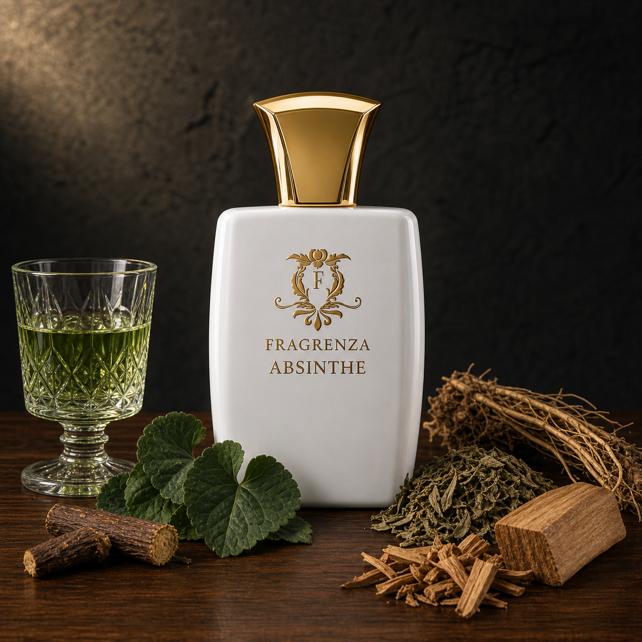
Ice Musk
illustrates how the minimalist sensibility translates into modern olfactory practice. The composition uses musk as a primary material with the kind of clean architectural simplicity that recalls the spirit of the No 5 bottle even though the olfactory references are entirely different. The transparency, the restraint, the focus on a single material treated with care: these qualities echo the design philosophy that produced the iconic flacon and demonstrate how the same aesthetic principles can be applied across very different sensory media.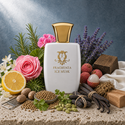
The connection between bottle design and olfactory design has always been intimate. The minimalism of the No 5 bottle implied a certain kind of perfume inside, and the modernist composition that Beaux delivered fulfilled the implication. Modern perfumers and designers continue this dialogue, often producing bottles and compositions that reinforce each other through shared aesthetic commitments rather than treating the packaging as a separate concern.
The Cultural Reception
The cultural reception of the No 5 bottle has gone through several distinct phases. In the 1920s and 1930s, it was experienced as radically modern, sometimes controversial in its rejection of decorative conventions. By the post-war period it had become familiar, almost canonical. By the late twentieth century it had achieved iconic status, regularly featured in art exhibitions and design histories. Today it occupies an unusual position as both an everyday consumer product and a museum object, a piece of industrial design that millions of people own and that simultaneously appears in retrospectives of twentieth-century design.
This dual life is itself a measure of the design's success. Few consumer objects manage to remain in production for a hundred years while also being recognised as art. The No 5 bottle's ability to occupy both roles simultaneously testifies to the durability of its underlying design choices.
Why the Bottle Still Matters
For students of perfumery, the No 5 bottle illustrates how packaging contributes to the meaning of a fragrance. The composition inside the bottle and the bottle itself create a unified message, and this unity is part of why certain fragrances achieve cultural permanence while others do not. No 5 would have been a great composition in any bottle, but the specific bottle Chanel and Helleu specified amplified the cultural impact of the composition by giving it an unforgettable visual identity.
For consumers thinking about how to choose fragrance, the No 5 bottle is a reminder that packaging is part of the product. A great composition in indifferent packaging often performs less well in the world than a great composition in packaging that reinforces its identity, and the most successful luxury fragrances usually exhibit careful alignment between olfactory and visual design.
Related Reads
- Chanel No 5 cinema: the marketing tradition that grew around the bottle
- Chanel Coco Mademoiselle: the successor in the Chanel lineage
- Sustainable packaging: modern packaging considerations
- What is niche perfumery: the field that took up the modernist mantle
- Aldehydes in Perfumery: the materials that filled the bottle
- How to choose your signature scent: the No 5 question writ small
Frequently Asked Questions
Who actually designed the Chanel No 5 bottle?
The design is generally attributed to Jean Helleu, who worked with Coco Chanel on the original specification in 1921. The exact division of labour between Chanel and Helleu has been debated by design historians, with most accounts suggesting that Chanel provided the conceptual direction and Helleu executed the visual specifications. The 1924 refinement that produced the version most people recognise today involved additional contributors as well.
Why is the No 5 bottle considered so important in design history?
It broke decisively from the decorative tradition that dominated perfume packaging in its era, introducing geometric minimalism as a viable luxury aesthetic. The bottle participated in the broader modernist moment that was reshaping European design across architecture, furniture, and graphics, and its survival as a successful commercial object for a hundred years has made it a touchstone for design historians studying modernist industrial design.
Has the bottle changed since 1921?
The underlying geometry has remained constant, but subtle adjustments have been made over the decades. The original 1921 flacon was somewhat different from the version that became iconic; the 1924 redesign simplified and refined the original further. Subsequent decades have involved minor adjustments to glass thickness, stopper dimensions, typography, and label proportions, but the fundamental design has stayed remarkably stable.
Why does minimalist packaging suit luxury fragrance?
Minimalism signals confidence in the product. Excessive decoration can suggest that the packaging is compensating for inadequacies in the composition, while restrained packaging suggests that the composition is strong enough to be presented without ornament. The cultural conventions of luxury have shifted over time, and the dominant convention now treats restraint as a more reliable signal of quality than decoration.
Does the bottle design affect how the perfume smells?
Not directly, but it affects the wearing experience significantly. The visual presentation creates expectations that influence how the wearer perceives the composition, and the alignment between bottle and perfume contributes to the overall impression. Wearers consistently report different responses to the same composition presented in different bottles, which is why luxury fragrance brands invest heavily in packaging design.
How do I tell if a bottle's design is genuinely good?
Look for elements that serve function as well as form, proportions that produce a sense of stability and presence, and details that withstand close examination without revealing decoration that does not earn its place. A great bottle should look better the longer you look at it, with refinements that reward attention rather than gimmicks that fade on closer inspection.
The Bottom Line
The Chanel No 5 bottle is one of the great achievements of twentieth-century industrial design, and its influence on perfumery packaging has been immense. Understanding the design choices that made it successful provides a framework for evaluating other fragrance packaging, and the principles it embodies remain relevant to modern compositions that share its commitment to restraint and architectural clarity.